GitHub repository for this website can be found here.
Why the redesign?
People who have been following my website (read: people I’ve forced to proof-read my website) will know that it has undergone several redesigns. I never truly was happy with them since I usually just used open source or even premium Jekyll themes and inserted my content into it. Now that isn’t to say I have anything against this, but I always wanted a larger sense of ownership.
Another reason is that I got a job at Jagex and now that I felt more settled in my career I wanted to make sure my website was a little better equipped for what I wanted to put on here.
Instead of doing advent of code this year, I decided to rework my website and create it using Hakyll. It’s like Jekyll but can be programmed with Haskell to suit your needs. I’ve had a Hakyll blog in the past, but my problem was it was quite annoying to set up and work with on other machines if they weren’t set up for Haskell development.
Inspiration
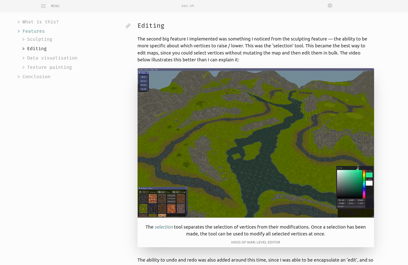
My biggest inspiration by far for this website was Yannik Sander’s website. It was clean yet extremely functional, and best of all it took advantage of both Nix and Haskell. Without his website, I wouldn’t have had the motivation or starting point to recreate my website. It is my intention to one day distinguish my site from his and really make it my own, but he’s done such a good job that it’s hard to resist using some of his visuals!

A screenshot of Yannik’s impressive website.
Tools
Nix
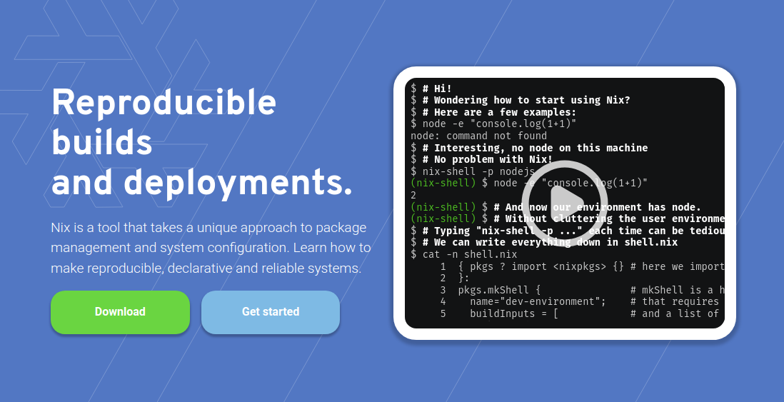
Since I’ve been nixifying my operating system and the way I work in my free time, it was a no-brainer to use Nix. I’ve tried using Haskell and Hakyll in the past, but having to set up my environment for Haskell development each time I wanted to write a post was beyond tiresome. If you want to learn more about Nix, I wrote a post about it specifically title ‘what is nix?’
Nix is a reproducable, declarative and reliable way of building and deploying software.
- Reproducible: Nix builds packages in isolation from each other. This ensures that they are reproducible and don’t have undeclared dependencies, so if a package works on one machine, it will also work on another.
- Declarative: Nix makes it trivial to share development and build environments for your projects, regardless of what programming languages and tools you’re using.
- Reliable: Nix ensures that installing or upgrading one package cannot break other packages. It allows you to roll back to previous versions, and ensures that no package is in an inconsistent state during an upgrade.
Information taken from the official Nix website found here.
Now that the website is running Nix, I have no worries about using Haskell. I never have to worry about which GHC version I need to install, or what tooling is now the best choice to use for my text editor when writing Haskell code. If I ever need to work on a new machine, I just need to do three things:
- Acquire
Nix(I run NixOS, so this is already done!) - Clone repository
nix develop
And boom, I can continue working on my website!
Haskell + Hakyll
Of course this website uses Haskell! Thanks to Hakyll, I have full control over how posts are curated, how markdown is translated to html, and even the URLs. It can be confusing at first but once you have a simple site going (that you can probably steal from the docs) you can iterate on it very easily to experiment with how you can make changes.
Tailwind
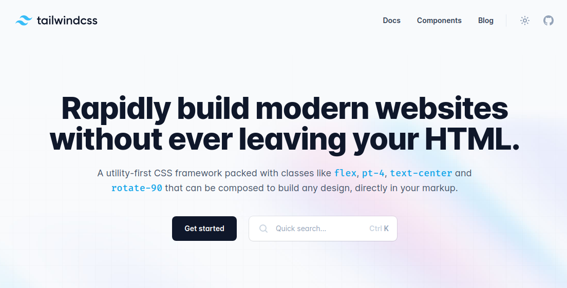
I’ll be honest, I’m not a web designer and I don’t really understand what the best choices for these things are. I saw a lot of buzz about tailwind and when I saw it in use on some blogs made by other people, I thought to myself ‘this is great!’ and committed to using it in my own website. My favourite thing about tailwind is that it can be customised and extended pretty easily by it’s tailwind.config.js file. This means I can change the font of my website or the colourscheme all in a single place. I imagine this is possible with CSS as well, but this works well for me.

Tailwind’s website
New features
Below are just some of the things I’ve always wanted to put into my website
Dark mode
In the past I had a really couldn’t decide between having a minimal white website, or a nice dark one. I decided to support dark mode from the very beginning of my website’s development, and thanks to tailwind it was a fairly painless process so long as I tested every feature in both light and dark mode. All you need to do is click the sun/moon icon in the top right of my website and everything will change colour!
Table of contents
I’ve seen on a few people’s websites that they have a nice smooth way of navigating chapters of their blog posts, and I wanted to include this on my website as well. I previously had a progress bar to indicate how far you are through a post, but it’s nicer to have a table of contents built into it! If you have a large monitor, the table of contents for a page will display on the left of the content!

A preview of a page’s table of contents.
Project posts
Some people have a notion of a ‘series’ of posts and I wanted to include something similar to that in my website. I’d rather have the page of a project be a timeless record of the project, and the historical records be encapsulated in blog posts. This very post is a project-post — the project is aas.sh, and any updates I make to the website will be detailed in the posts!
This does mean there might be some duplicated information, but the information in the project itself will be 100% correct, whereas the project posts are allowed to be no longer correct yet still stand as a record of what was previously the case.
Image galleries
Using SwiperJS, I was easily able to create smooth, slide-show like image galleries. I’ve used these to showcase featured posts, regular posts and even images of a single post. You’ll find them all across the website and they’re a very handy way of making things look clean yet still show everything I want to show!
Wrap up
I’ll probably write some more blog posts that relate to cool or important updates to the website, but right now I’m very comfortable with how things have come out. I might play around with fonts and add new pages, but for now I’m going to get back to work and focus on actually putting more content on here!


